The Team
- Discovery Lead (Me)
- Supporting designer(s): 3
-Product Manager
- UX Research
-Engineers: 6
The Timeline
-Discovery, Iteration, & Initial Testing: 9 weeks
-Additional testing & development: 6 weeks (MVP)
-Enhancements of additional features completed by the end of 2022.
The Problem
The Item Display continued to face ongoing requests to enable more visibility to features on the item listings, which risk creating cluttered cards that confuse and distract customers.
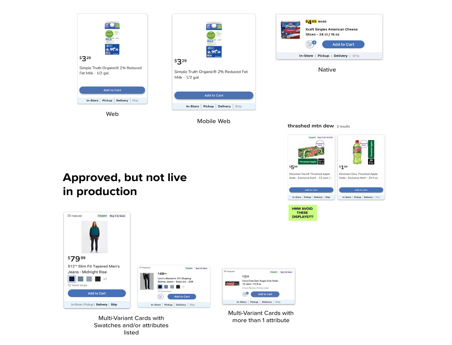
State of the product cards at the start of the discovery
The Challenge
With the business need for new features on the horizon, the current layout's limitations became more visible, such as:
-New features quickly clutter and complicate product listings
-Web did not support the save to list function
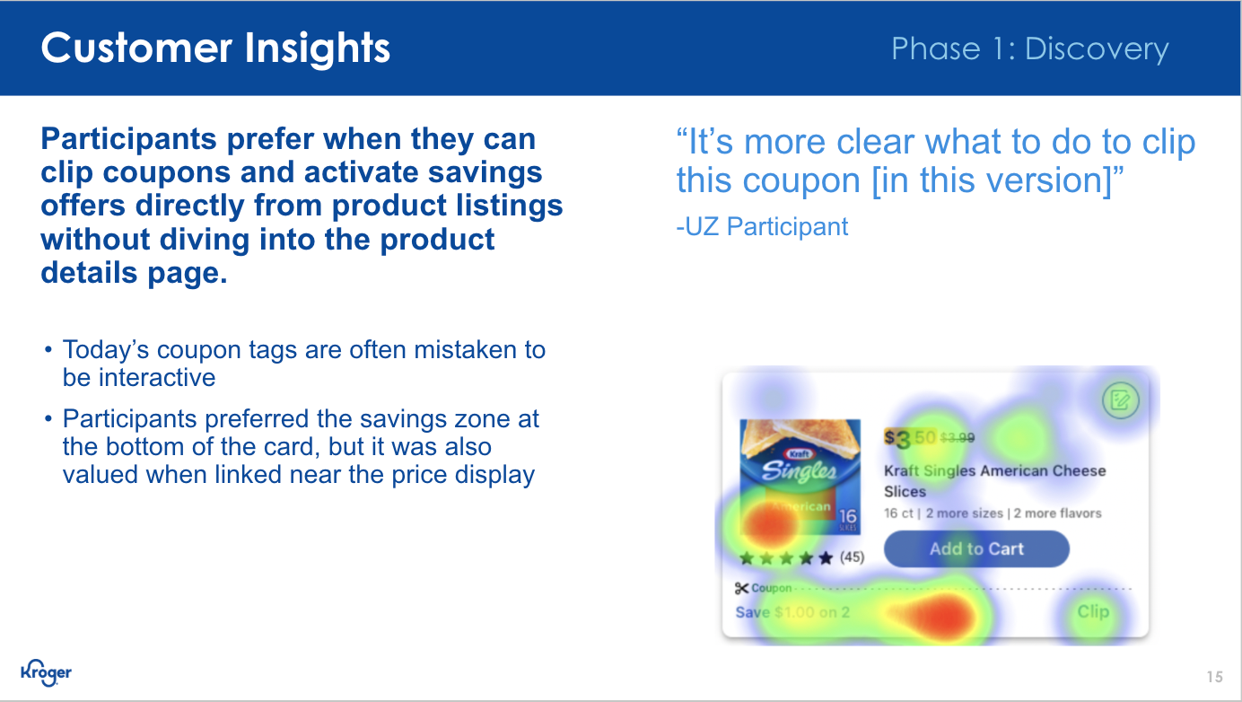
-Coupons are visible, but required product detail view to clip
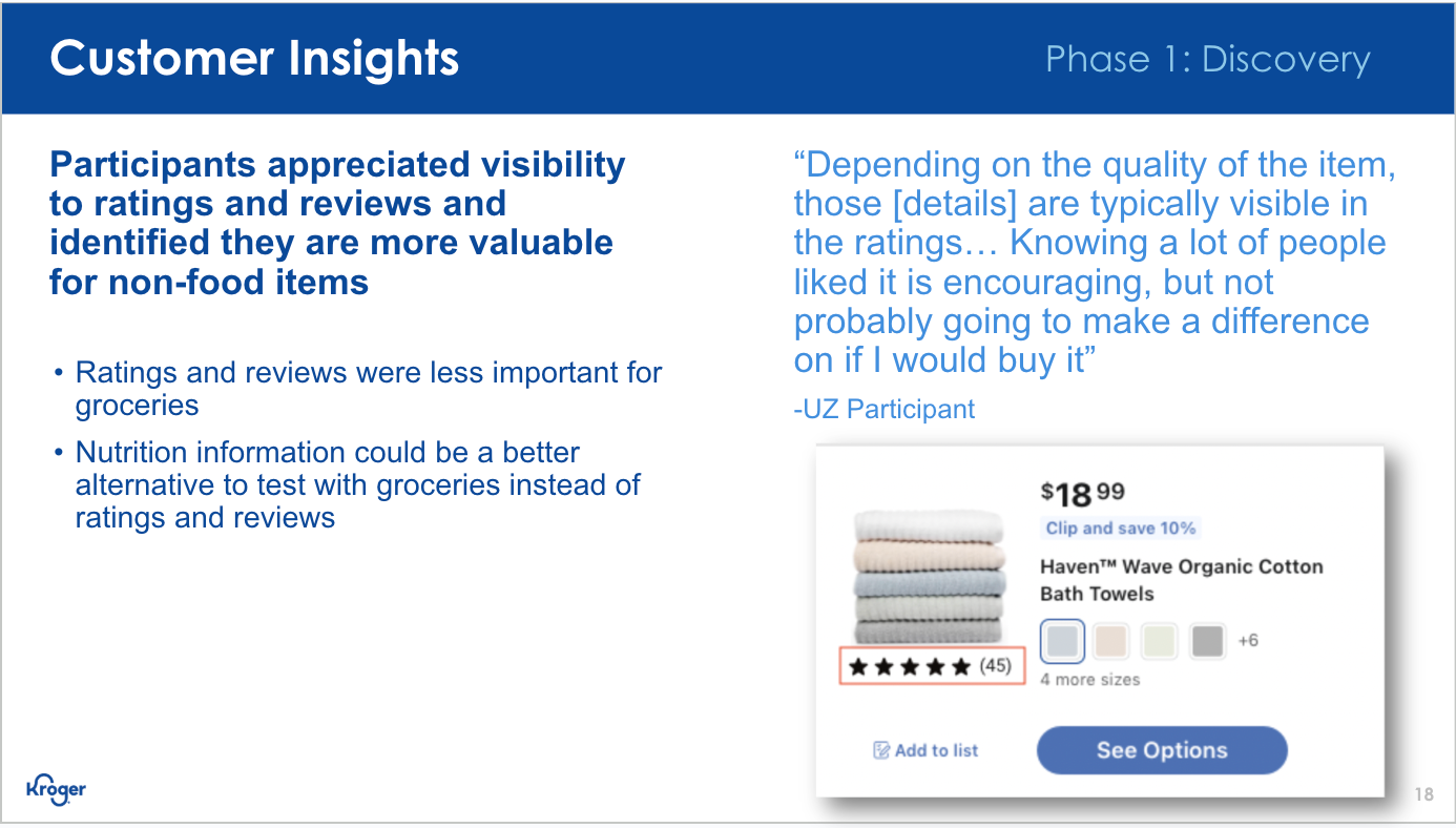
-Ratings and reviews are not supported outside of product detail
Exploration of what the cards would potentially look like if we proceed with all current business requests.
The Opportunity
How Might We (HMW) design a card that balances customer needs and the needs of the business?
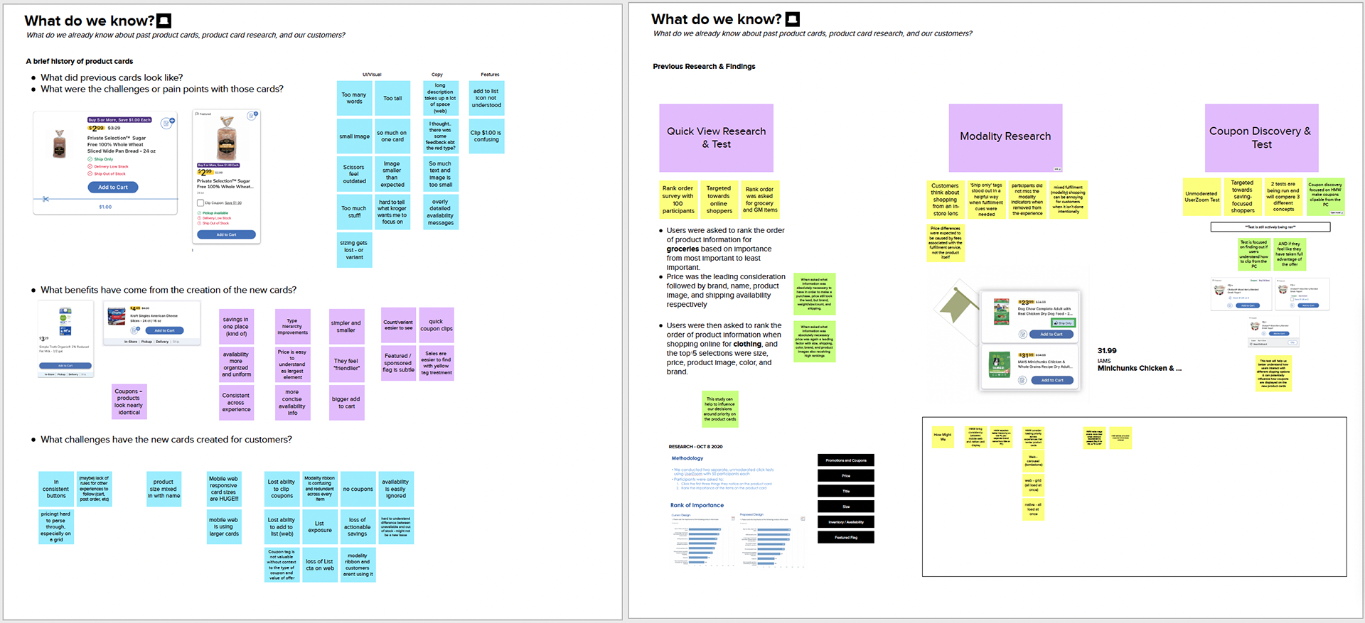
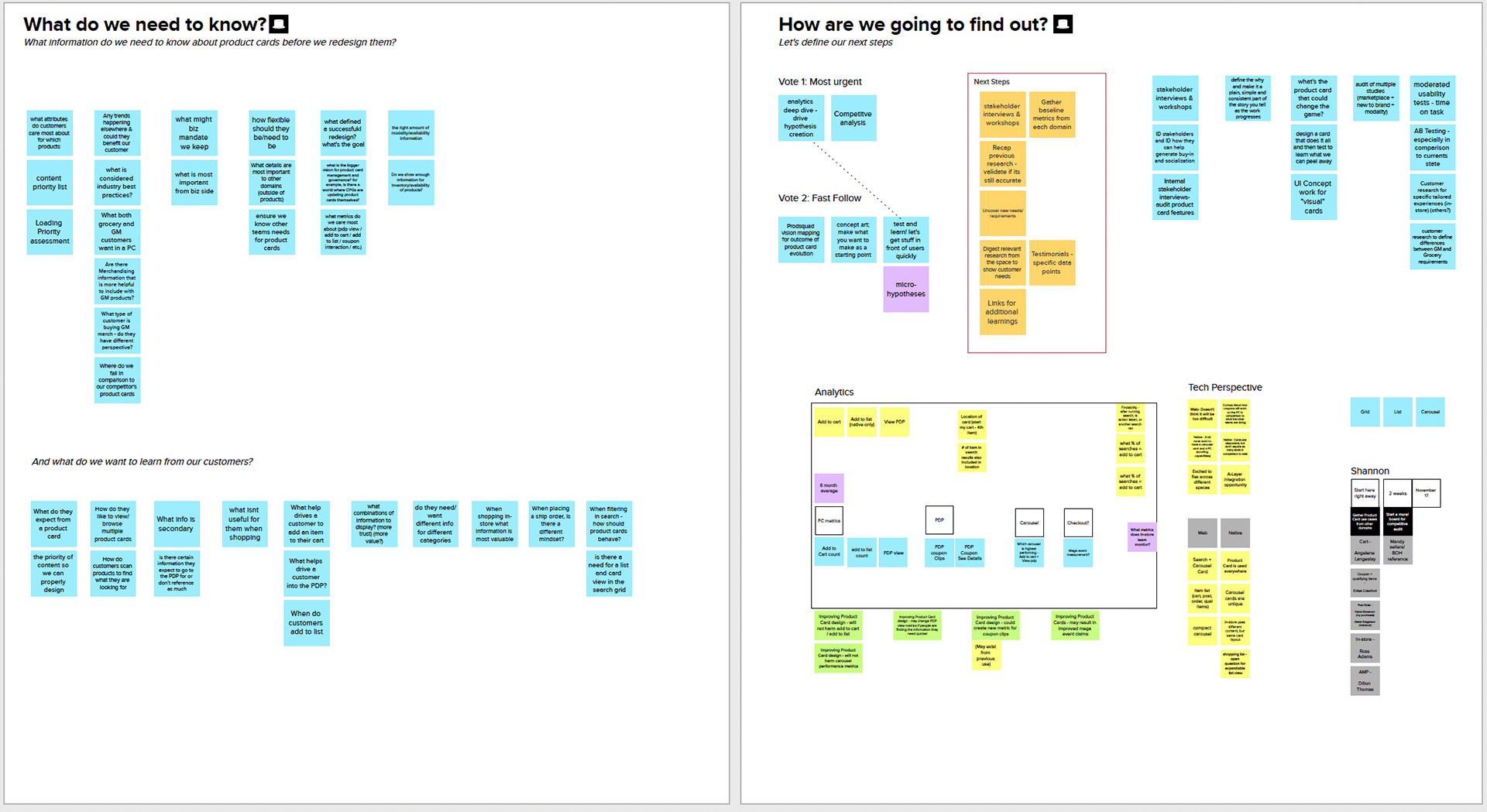
Our team was given the space to run a design discovery on the future of product cards. Discovery began with an initial kickoff that outlined what we currently understood about our cards and the many changes they had been through over the years to get to where we were. By outlining what we already knew from previous research, related discoveries & research (fulfillment & coupons), upcoming business requests on the horizon (ratings & reviews and item variants), we were able to focus on filling in the gaps to better understand what our customers want & need.
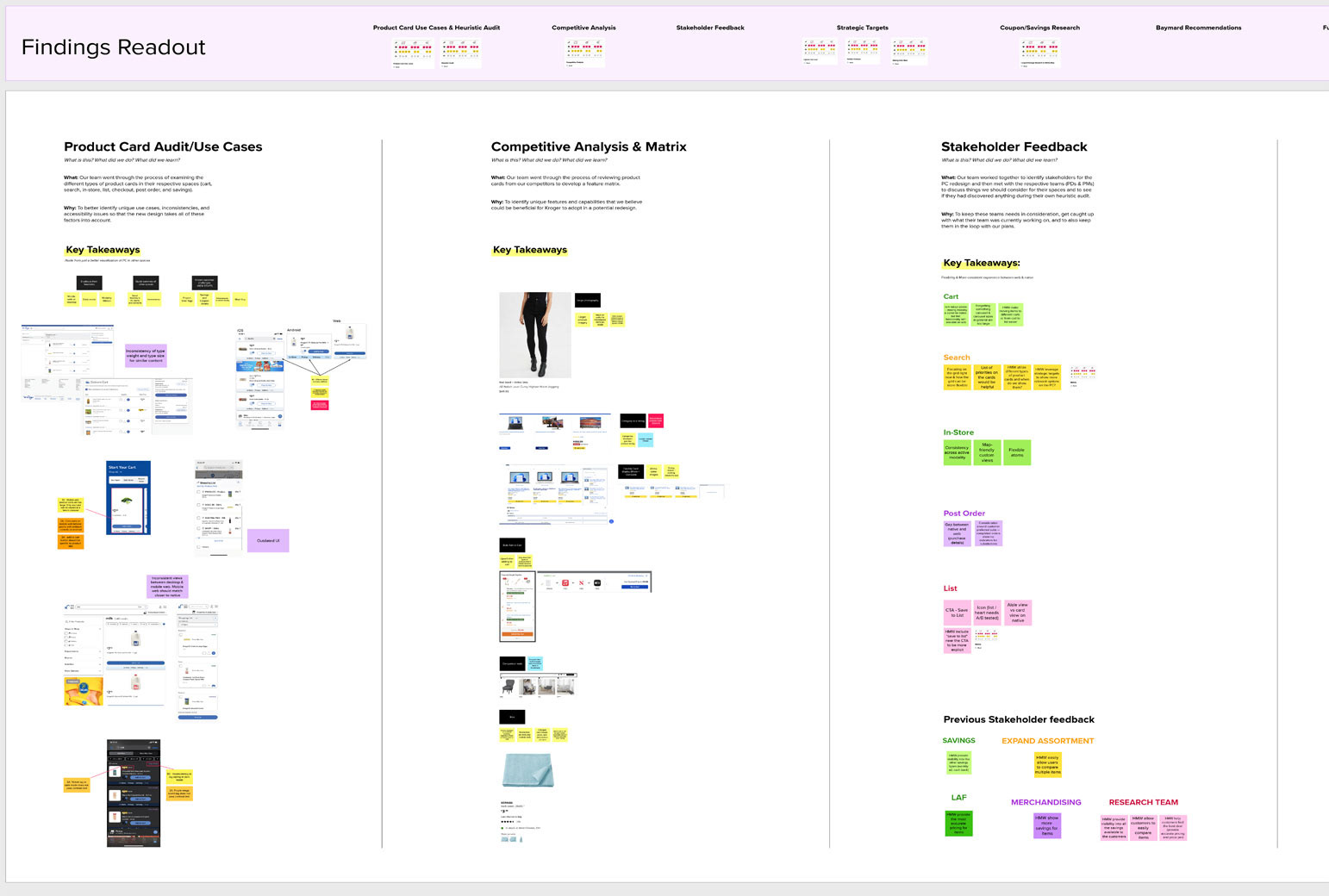
Audits, Competitor Analysis, Stakeholders, & Best Practices
After the discovery kickoff was complete, we felt like we needed a more wholistic view of the cards and where we could take them in the future. So over the course of several weeks we ran audits of all of the variations of product cards, looked at what competitors were doing, spoke to stakeholders, spoke to other designers about their related research, and combed through best practices from Baymard.
After those activities were complete, we felt that we had enough information to being iterating on concepts that would go into usability testing and would also serve as our visuals for capturing our qualitative data.
User Testing & Customer Insights
-Qualitative Usability Testing (unmoderated)
-Quantitative Survey(s)
-Continuous iteration & additional testing (as needed)
-Narrow solution to 1 concept > build out
-A/B testing for new features in alignment with MVP rollout plan
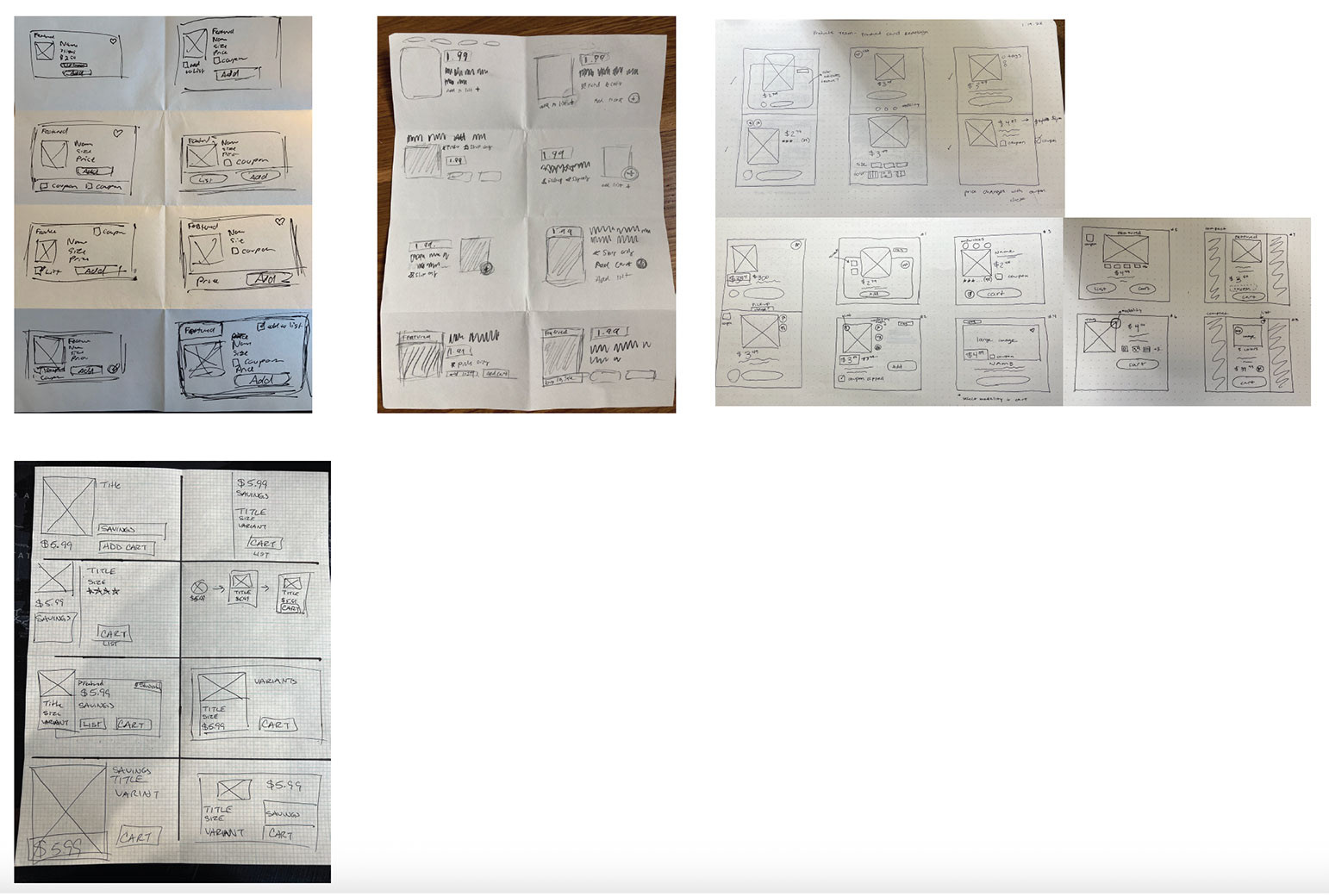
Crazy 8's sketching exercise with design partners
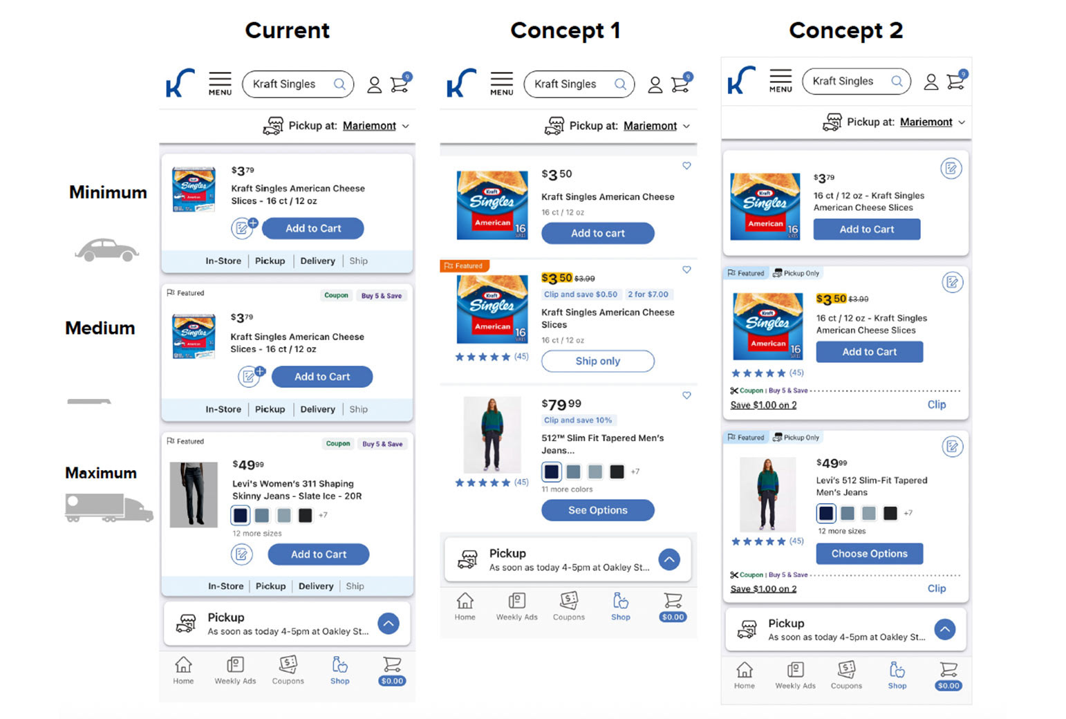
Sketches were turned into mockups, and then those mocks were then voted on and narrowed down to 2 concepts for engineering preview and initial user testing.
User Testing & Customer Insights
With our concepts narrowed down, it was time for a research plan and initial testing. Our testing of this updated feature included:
-Qualitative Usability Testing (unmoderated)
-Quantitative Survey(s)
-Continuous iteration & additional testing (as needed)
-Narrow solution to 1 concept > build out
-A/B testing for new features in alignment with MVP rollout plan
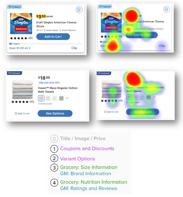
Survey Findings
(Quantitative, 100 participants):
(Quantitative, 100 participants):
-Title, Image, and Price are always the most critical piece of information
-Coupon/Discounts and Variant Options are the next most valued by customers
-For Groceries: Size and Nutrition info are valued
-For Non-Food: Brand Name and Ratings & Reviews are helpful
-Featured Tags and Item attributes such as ”New” or “Exclusive” are the least valuable details.
Usability Testing Insights (Qualitative, 15 participants):
The Initial Design Direction
Retain the simplicity, value of information, and convenience our customers expect. Build on what has been working well and restructure product cards to enhance the features that customers care about most.
Focus on our customer first, but integrate flexibility into the design to account for the presence of new features.
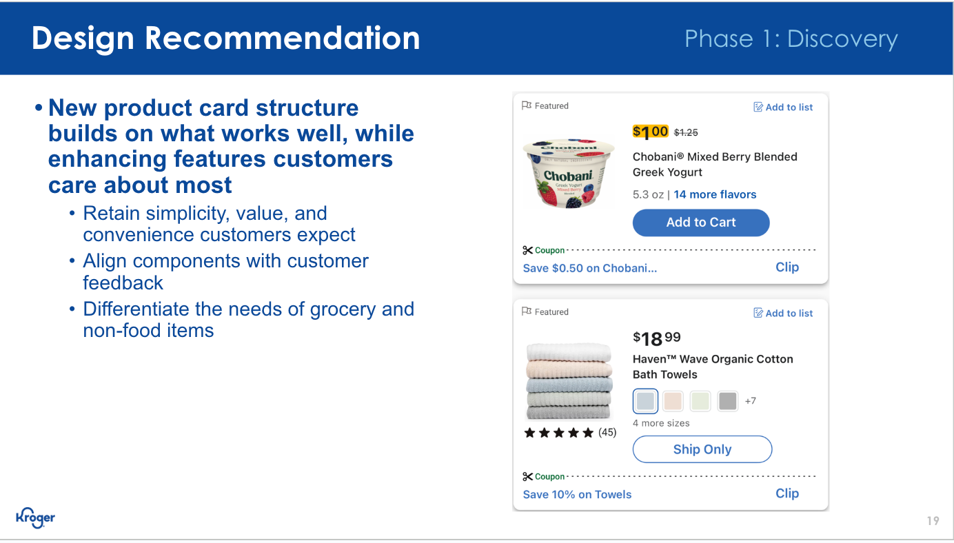
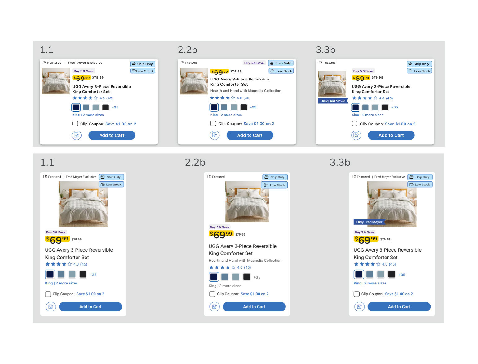
Initial design recommendation based off of unmoderated user testing & surveys
MVP (Phase 1.1 & 1.2)
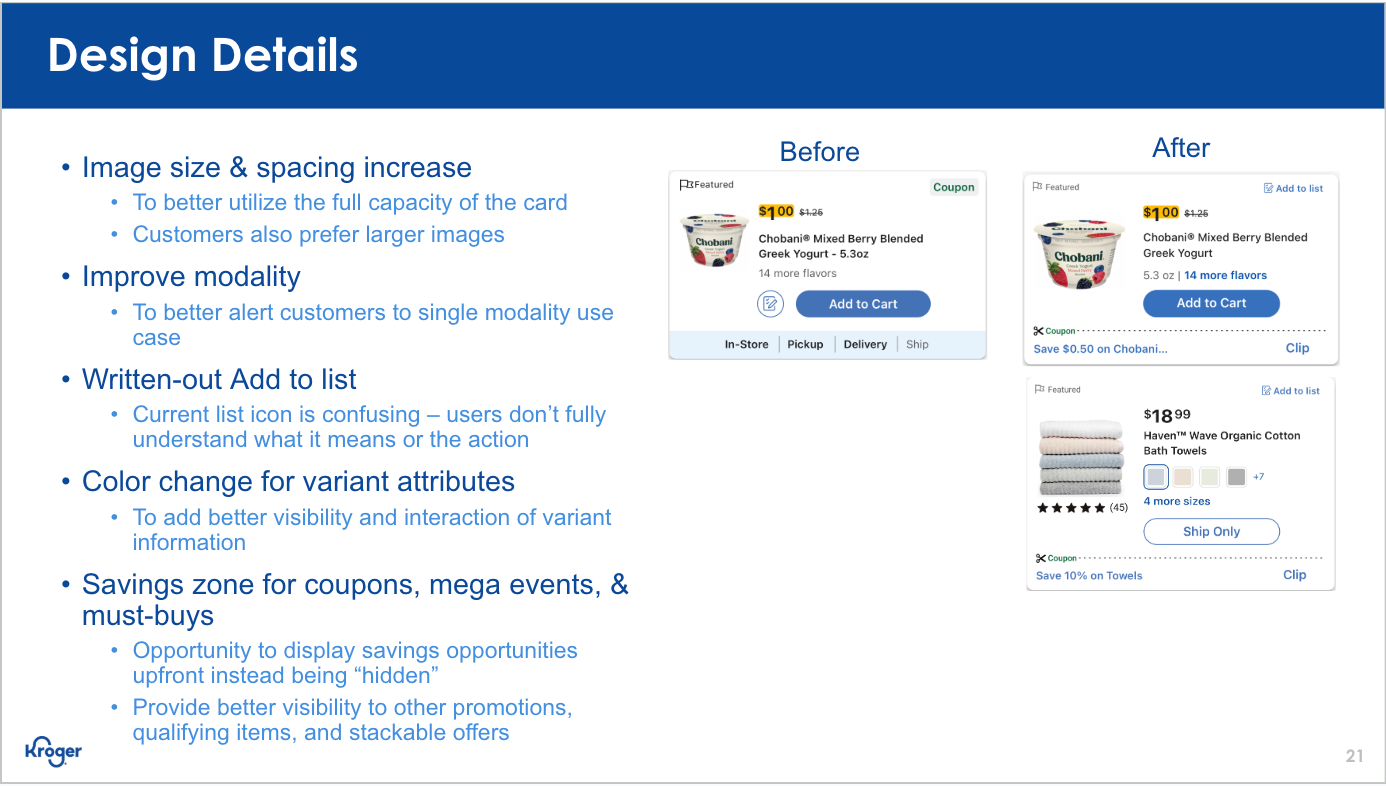
With testing complete and some additional support from UI, below is a sample of where we landed and what was handed off to our engineers for production.
Both Web (Desktop & Mobile) and Native received the various updates we highlighted. With the previous mockups having already gone through usability testing, we focused on refining UI elements so that they better aligned with Kroger's overarching design system and patterns.
For initial roll out, the team focused on small UI updates that could be easily changed with minimal risk, and then over time we introduced enhanced features to the cards so that we could continue to test & learn with our customers on the live site and native app.
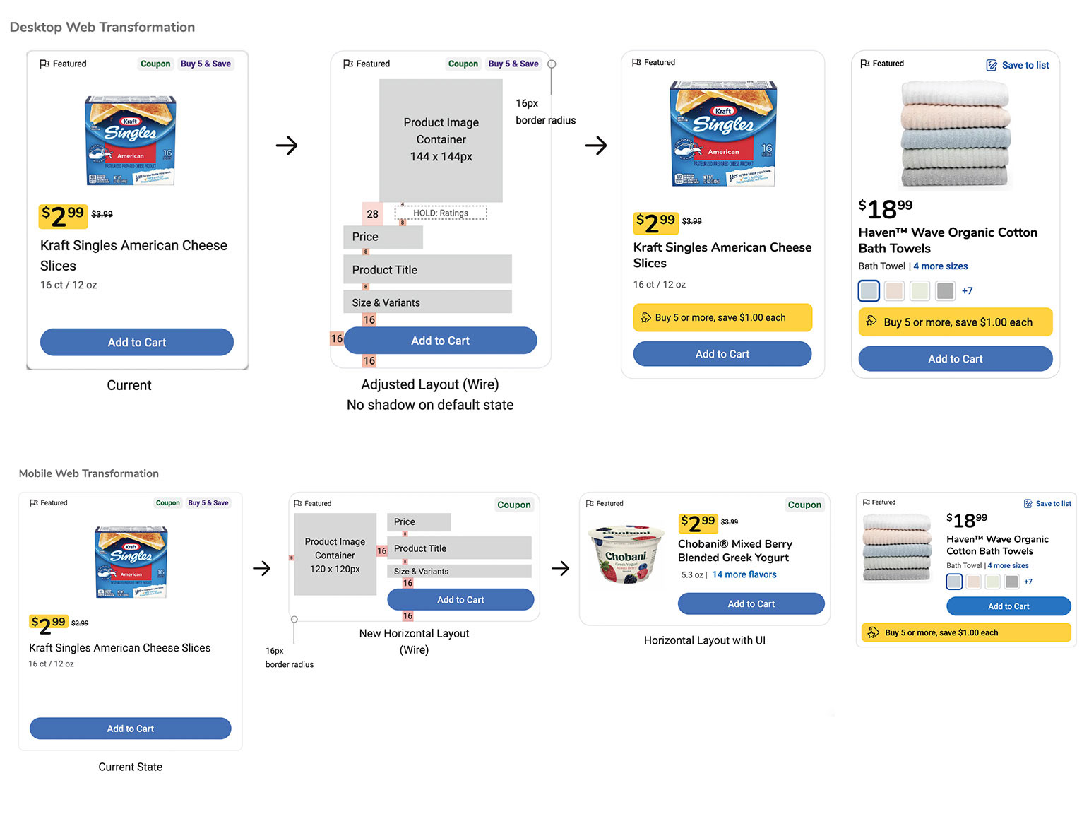
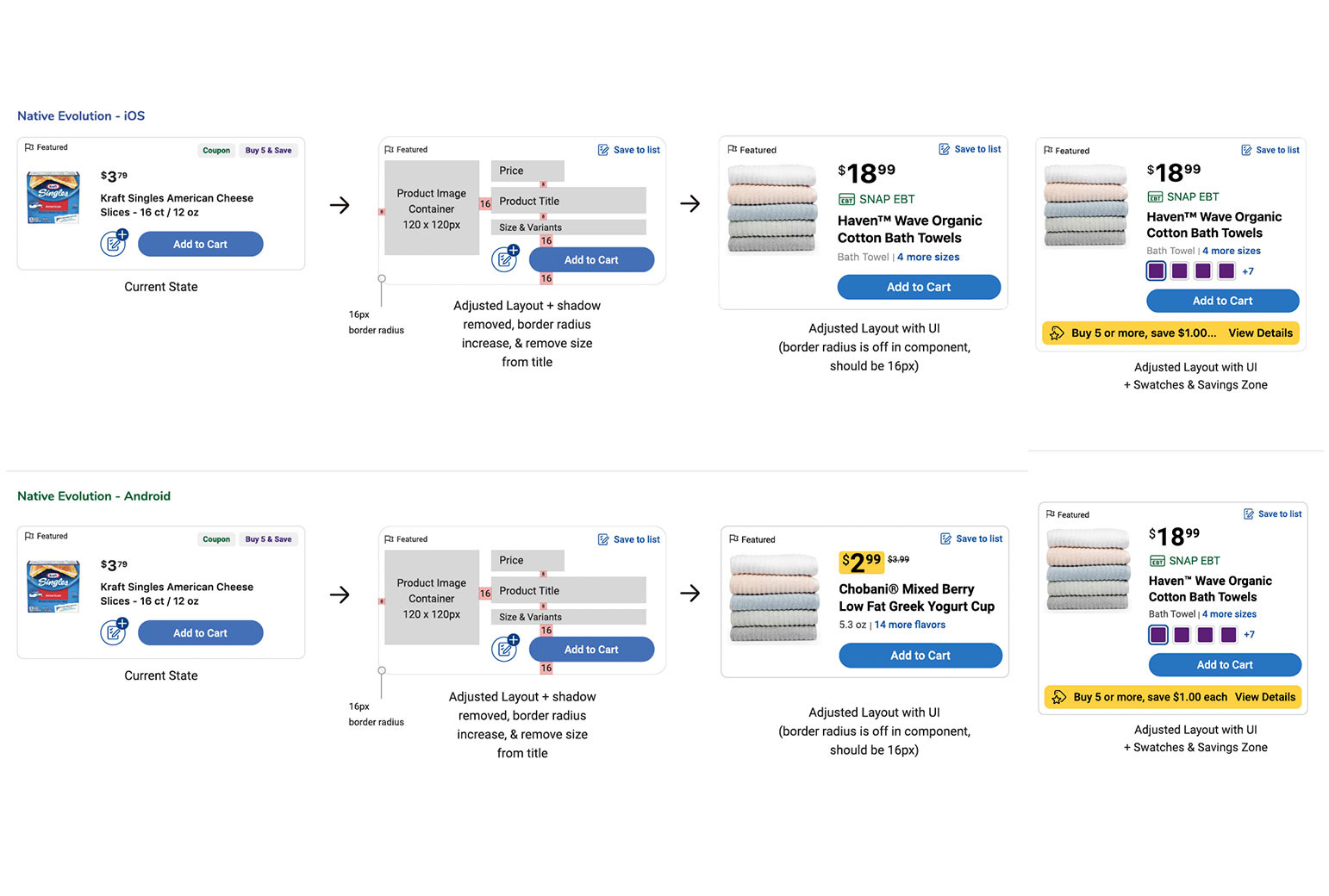
Sample of mocks handed off to devs after UI refinement